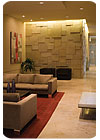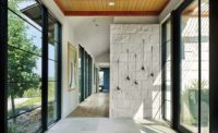

“We designed a random pattern of ‘in and out’ fluctuation of the wall, and cast light down so that the shadows on the stone give a feeling of depth,” said the architect. “They are all custom tiles of varying sizes, but not varying depth. Some have a backing of more grout in the back to make them look like they are different depths. If it didn’t have the light, there wouldn’t be depth.”
According to the architect, the design was intended to have a warm Texas feel that provides a relaxing space for residents and guests to socialize. “We did not want it to look like a hokey ranch, but not ultra slick either,” explained Clark. “We wanted something in between.”
The overlapping limestone pieces, which were quarried locally in Texas and have a re-sawn texture, were meant to resemble stacked stone that is commonly seen on ranches. “It’s a suede-like finish,” said Clark. “Anyone who walks in has to touch it.”
The architect also gave credit to the stonemason for his skillful installation. “All of the pieces were hand fitted,” he said. “[The installer] did a small section for us; we looked at it, and then said, ‘Go ahead.’ Once he got into it, he knew what he wanted to do.”
It took approximately two weeks to complete the installation of the limestone wall, according to Clark. “It is the kind of thing that starts off slow and gains speed,” he said, adding that the wall was sprayed with a matte sealer.
Adding a subtle contrast to the matte limestone wall tiles are 36- x 36-inch polished limestone floor tiles. “[The limestone] is intentionally different to slightly contrast, but it is from the same family,” explained Clark. Moreover, a third limestone was used for the reception countertop. This material also minimally differs from the other stones, and is polished, but not as shiny as the floor tiles, said the architect.
In the end, the building developer was extremely pleased with the results of the lobby design. “This was not a high budget job,” said Clark. “They were able to get what they wanted. It is the very first image that people see when they walk into the building, and the only public meeting space. [The limestone wall] dresses it up.”


