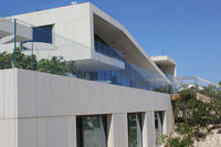
“It was important to reflect the company’s values in the design of this addition,” Chambers said. “This was accomplished through the use of sustainable materials, protecting the current environment, and preserving the embodied energy of the existing structure. The trough that creates a 12-foot waterfall into the lake is a visual and auditory reminder of the importance of water in Texas Regional design.”
Among the design goals were that Chambers needed to complement and expand upon the existing design of the home. “The original house was a modern brick box, which was done 20 years ago,” he said. “The homeowner, who was the architect for the original home, wanted to add more entertainment areas, develop a closer integration of the architecture with the lake, and increase the storage capability of the home.”
A sustainable design
The focus on sustainability can be found in all aspects of the project. “We were careful to use as much of the existing structural system as possible and to use materials that are sustainable and local,” Chambers said. “We worked to protect the lake itself with the use of a cantilevered structure. Additionally, we wanted to preserve the existing trees and the site’s natural Texas environment. Part of what we were charged with doing was to make this house a more efficient, comfortable space. We increased the footage and increased the amount of exposure to get more sunlight into the house. We did that by providing overhangs using the type of glass that allows light, while reducing the UV and radiant heat.”
Being an expansion, there were also some design constraints involved with the project. “Appearing expansive, in reality the site was quite tight, with a large front setback and a lake,” Chambers said. “The existing house occupied the other sides. It required creativity on the part of the building contractor, Bordeaux Custom Builders, to work in a very confined area.”
Chambers added that the design increased the benefits of the site. “It orients to the natural beauty, providing inspiration to the homeowners who have a sophisticated appreciation for art and color,” he said. “More north light was added into the home via the glass stair ‘box.’ We took advantage of all the landscape that is visually available and made it an integral part of the tighter site. The addition of a cantilevered first floor deck over the creek and a second floor deck created more entertainment areas, allowed for more outdoor living, and took advantage of the most dramatic features of the site’s natural setting.”
For Chambers, working for someone in the same profession made for a unique experience. “While all of the relationships with our clients are stimulating, fun and collaborative, when two architects work together, the communication is streamlined because they tend to speak the same language. Architects think and visualize in three dimensions and imagine what the spaces will be like more easily than most clients, who aren’t used to thinking this way.”
But even while both parties were architects, it was a traditional project dynamic in some ways. “It’s the same in that they are still the client with a budget, and there needs to be trust in the architect that he will keep the aesthetics, ideals and expectations of the client in mind,” he said. “And, as with any other client, the decisions were made using design studies, sketches, explanations and estimates, etc.
“When I left a large architectural firm in ‘70s to start my own firm, I decided I didn’t want to work directly for another architect again — I wanted my own firm,” Chambers continued. “But it never occurred to me that someday I might have an architect for a client. We have been fortunate to do three homes for architects, which is something I never thought I would do. With the three that I have worked with, we have had very nice collaborative relationships. I was amazed and happy with the result. We were all on the same team, and we all talked the same language. In all cases, the architects we worked for all did major commercial projects, and consequently, didn’t do houses. There were certain things that I understood, including how to work with a residential contractor as opposed to a commercial contractor. Also, the other architects brought knowledge of commercial materials and depended on their commercial experience, such as the use of the zinc siding, which emphasized the overall horizontal look.”
Selecting the stone
The choice of stone for the renovation came early in the process. “The client is an architect with a firm that is internationally known for sustainable design,” Chambers said. “It was important that we reflected this in the design of the house, because it is sustainable and local. Secondly, it makes a statement about regionalism — a modern regional design. Part of regionalism is the use of Texas stone, with a very Texas-looking use of the material. Third, stone has a very warm character. It is more relaxed, and so we have a contrast to the hard, crisp zinc siding — in a very modern, industrial look. The stone moderates that and makes it warmer. You have stone, the oldest material, contrasting with very modern materials.”
The homeowner conveyed this thought as well, “I really wanted to ‘soften’ the hard-edged modern look with the use of stone and add glass to open up the front of the house to the outdoors,” Barrick said.
In addition to the cream-colored Hill Country limestone, the walls feature a darker variety of Lueders limestone from Texas. “For years, the extraction of Lueders involved taking a bulldozer and pushing the stone off the surface, which they would never use, and then digging down a foot or two to cut the limestone out of the quarry. It makes wonderful cut and milled limestone for architectural shapes,” Chambers said. “Then someone started using the top layer, and now they can’t get enough of it. The top layer of stone has darker colors and shading from the natural minerals that are in the topsoil. These roughbacks went from being trash to something everyone now finds quite interesting.” The stone was supplied by International Stone, and the mason was Terry Lindsey of Lindsey Masonry.
Implementing the stonework
The limestone pieces were installed as horizontal masonry units. “My feeling about stone is that it should look like stone is intended — to be horizontal,” Chambers said. “I hate it when masons lay vertical pieces of building stone, because it is almost counterintuitive. You want the stone to be stacked horizontally because that’s where the strength is. If you look at the masonry from the times of the Greeks and the Romans — and before — they stacked the stone, and it stayed rigid under its own weight. Now that it has become a veneer material, all too often the mason doesn’t understand the history of the material. Overall, the exterior stone was installed over a period of four weeks. “We did some supervision,” Chambers said. “On a normal job, we feel that a lot of the job is to protect the owner. In this case, as an architect, the owner was very knowledgeable. Once we got the initial concept and detailing on the drawings, the owner did the supervision. And we had the added benefit of a very trustworthy contractor.”
One practical issue that came up during the stone installation was the framing of the home. “It was a slightly unusual existing house in that it was a steel frame building, which is not the norm,” Chambers said. “Most of the homes that we do here are wood frame, and the veneer simply sits on the foundation and is attached to the wood framing. We started with a steel structure and added to it. This is what supported the stonework. There was more engineering involved than we ordinarily do. Part of this was related to the fact that we wanted to cantilever the entertainment areas over the small lake. We continued the steel frame and needed to support the masonry on the steel.”
While not part of the building itself, there are also limestone outcroppings along the banks of the lake. “Here in Dallas, we have a kind of limestone that is a great foundation under the soil, as long as it’s not exposed to the air,” Chambers said. “It is a chalk-like material, not a building stone. It fits in with the site and gives the architect a contextual clue in the selection of Texas limestone.”
Now complete, the regional modern home has been well received. “There has been a lot of interest in publishing it, placing it on home tours, and people are excited to go and see it,” Chambers said. “But most rewarding to me is that this was another successful collaboration with a client who is an architect, and the architecture and stunning site complement each other in a sustainable way.”


