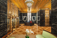
Swift Plaza, an office structure that is part of a complex of buildings that was formally a Bank of America campus, originally had an institutional-like lobby and an entry that was rather confusing and ineffective. To give it a fresh image, the space was converted and repositioned to provide a more accessible entrance, according to Eileen Pereira, principal, LEED, at Aston Pereira & Associates in San Francisco, CA, the architectural firm that led the overall design process.
“This building used to be an old Bank of America building, so it was kind of a commodity,” said the architect. “It has one of those stone styles when you enter the building. The whole lobby was badly designed, and once we were done with it, we took it from a Class ‘B’ building to a Class ‘A’ building. We changed the entire presentation that the building had, in terms of how it presented itself.”
Since the 4,500-square-foot lobby was oddly shaped, Pereira explained how she and her design team had a decent amount of work on their plate once they began the project, which included reconfiguring and moving certain walls in order to construct the specific type of layout they were looking to achieve. “The lobby is a square donut-shaped building with entries directly opposite each other from Grant Street and Swift Plaza,” Pereira explained. “This makes the location of the guard desk that can control both entries impossible. The narrow space around the core functionally restricts the location of a guard desk and seating.
“The client’s objective was to reposition the lobby in order for it to serve as a single- or multi-tenant lobby,” she went on to say. “The design moved the existing glass walls on the Grant Street and Plaza side to the drip line of the building to make the lobby functional. The relocation of the entry doors allows centralized control with a space in proportion to the building with areas for seating. New canopies over the entry help further define the entries and bring the Grant Street entry to the front. The design of the relocated glass wall also complements the curtain wall of the building.”
The first and primary challenge for converting Swift Plaza from a Class “B” building to a Class “A” building for the architectural team was “creating a point of control within the lobby,” according to Pereira. She explained that it needed to be solved by relocating the curtain wall to the exterior facade of the building. “This created an additional space, enabling us to locate the guard desk and seating groups, providing the lobby with a point of control and making the space user-friendly,” she said.
To accomplish the high-end, yet business-appropriate look for the Plaza, Pereira and her team employed a range of marble and granite throughout the different areas of the lobby, which was supplied collaboratively through Silver Creek Tile & Stone in Santa Rosa, CA, and ASCS International in Danville, CA. “We designed new treatment for the floor and ceilings,” said the architect. “The core interior lobby walls were Carrara marble, which we kept and restored. Playing off the existing Carrara marble core walls, we used marble on the floors and dropped cherry wood detail canopy in the ceiling to design a dramatic intervention within the space. Clustered lighting and dramatic feature light fixtures complete the new details within the lobby.”
Although several walls were torn down and repositioned within Swift Plaza to give the building a completely new blueprint, there were certain walls that had to be accommodated, given their size. “The GFRC (Glass Fiber Reinforced Concrete) walls at either end of the lobby are large elements, which would’ve been too expensive to replace,” she explained. “We used strips of Carrara marble inserted into the spaces in these walls. The simple detail updated these walls and connected them with the rest of the surfaces within the lobby.”
Despite the complicated aspects of this project, the design team managed to incorporate some elegant touches. The floor design in the lobby, which features a custom waterjet 2-cm-thick stone mosaic, utilizes a combination of Golden Age/Melange marble, Statuary Vein marble, Marron Cohbia granite and Caledonia granite. “The pattern was developed to define the entry to the elevators and draw users into the space, while enhancing the flow and expanding the volumes,” said Pereira.
“The stone was custom cut into different radiuses and lengths, as well as different-sized squares and rectangles,” added Leo Pennacchio, owner of Pennacchio Tile, Inc. in Rohnert Park, CA, who led the overall installation process. “It was installed over a mortar bed that was required to meet different heights throughout the lobby. The stone was laid over a crack suppression membrane and installed in sequence to achieve pattern and grain match laid out overseas.”
Pennacchio explained how he and his crew installed the mortar bed over existing concrete slabs to meet heights at the entrances at both the north and south ends, as well as at the elevator cabs in the center of the lobby in order to meet the specific requirements of the project. “We installed Laticrete Hydroban as crack suppression on the entire floor and installed the large stone using Laticrete 253 thinset and PermaColor grout,” said Pennacchio. “We used the Tuscan Leveling System throughout the floor to help achieve a flat installation. Some of the large marble stones were 36 x 54 inches and had to be handled using three to four men using suction cups to help lay the pieces in place. Due to the fact that the lobby had different height issues at the various transitions, the floor was laid in a concentric circle so we could adjust the stone to meet the various heights as we went around.”
Since the majority of the stone was already pre-cut by the time it arrived at the jobsite, the design team didn’t have much extra work when it came time to install. “We did spend time on-site supervising, but actually not as much as we normally would because the vendor that manufactured the stone cut all of the pieces in Italy,” said Pereira. “So when they arrived, they were almost spot on. There were a few cuts that they had to make locally, but not that much. The real challenge was to get the aesthetic that we wanted.”
Being that the stone came directly from Italy, mockups weren’t provided, but the team was still able to view all of the stone that was selected prior to its arrival. “We selected from photographs,” explained Pereira. “They did send samples. Most of the stone was pretty straight forward, but the French stone — Golden Age/Melange — is one that has a lot of character to it, so sometimes you don’t see as much of that character in the photograph, so we were very careful in the selection; we knew what we were looking for, so we guided them on that.”
Aston Pereira & Associates is no stranger to designing high-end commercial spaces — specifically lobbies, like the one seen in Swift Plaza — according to Pereira. The firm has received several awards for similar projects they’ve worked on in the past, including a recent award from the Marble Architectural Awards North America 2014, IMM Carrara, which was given to them for a lobby they designed in a similar building in the area, 135 Main Street, which is located in San Francisco.
Given the team’s expertise with similar materials and spaces in the area, this project was something they successfully executed, and which their client is overly joyed with the turnout of. “They have an enduring classical lobby that is welcoming and full of light and energy,” said Pereira.
Swift Plaza was the recipient of a Coverings Installation & Design (CID) Award, in the “Commercial Stone Installation” category, which was presented during Coverings in Orlando, FL, this past spring.
|
Swift Plaza Concord, CA Architect/Designer: Aston Pereira & Associates, San Francisco, CA Stone Suppliers: Silver Creek Tile & Stone, Santa Rosa, CA; ASCS International, Danville, CA Stone Installer/Fabricator: Pennacchio Tile, Inc., Rohnert Park, CA
Installation Products: Laticrete, Bethany, CT; Pearl Abrasive Co., Bell, CA; |


