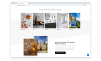
CASTELLON, SPAIN – Venux, a hard surface manufacturer, recently launched a new website, www.venuesurface.es. The digital space is designed to offer users an agile, intuitive and visually attractive experience, making access to the company's products as easy as possible.
With an extremely modern interface, the site allows users to find detailed information about products, services and, in the future, projects, in a simple and quick way, providing a very careful user experience.
In the words of Sabrina Veral, marketing director at Venux, “We wanted to create a platform that reflects our commitment to quality, design and excellence. The new website not only offers a more intuitive navigation, but also improves interaction with our customers, allowing them to explore our products in a more interactive way. We have studied all the possibilities, what works and what doesn't, to achieve an excellent website and we still have a few months left to show some sections that are not initially available.”
The new website features an editorial design that prioritizes engaging visual storytelling and a visually striking approach. “The images, typographies and texts are harmoniously organized to tell our brand purpose and transmit a clear message, which, we believe, will help to capture the visitor's attention from the very first moment,” stated the brand.
The website is designed with attention to detail, structuring the content in a clear and orderly manner, and without superfluous content, offering a fluid user experience, designed to guide the user naturally and comfortably through the space.
With this website, Venux’s intention is to authentically reflect the values and spirit of the brand, giving it a unique personality in the sector. The combination of quality images, carefully selected typography, color nuances and a solid narrative organization allows Venux to communicate a coherent and powerful message that touches the heart of the visitor.


